first dataviz with R and shiny
When talking about data management we think directly of data processing, storing in data lake, ETL, this first article is more focusing on data visualization.

Introduction
Some may choose to do complex things as a starter, use market place solutions that could perform everything from the data analysis to API presentation for scoring through data visualization. It is also possible to do small things based on free access products, like presenting data on a simple web site. What is really cool is to let the user play with the data through faceting, filtering and present the result using few appropriate widget.
The solution I would like to present in this article is based on the R language and called R shiny. You will find a lot of documentation on the net, directly on the editor web site, these are mainly focusing on result more than on the way to accomplish it. Since reading the sources could be complex as a rookie, here is the first article focusing on how to start with R and shiny. We will focus more after on hosting the web site or using other graphic libraries.
So let’s start with installing the appropriate tools and looking at a very simple dataviz example.
The dataviz
Rather than explaining an existing solution, I propose to build one from scratch based on data already available in R. If you want to have a look at the final result, you could directly go to airqual 1 web site. You could also get the sources from my git repo: git.
Tools
In order to complete this first example, you will need to install the R language interpreter and the Rstudio IDE solution. RStudio is a very useful integrated working environment allowing to build application, evaluate commands in the interpreter and navigate through both the data and the language documentation. To start a simple dataviz that will be exposed on the web, you can use the Shiny web application project template.
To keep it simple, start with a single file application (named app.R), even if less easy to read with big dataviz it is easier in our simple case.
If you get the files from the git repo through cloning, you could directly open the app.R file which contains everything important for our first example. From this point, you can also launch the application by hitting the Run App at the top of the editor window, it will be easier to follow the source by seeing the result.
How it works
Building the application
An R shiny application is split in two main parts: the ui (user interface) and the server (calculation part). The UI concentrate all the parts that will be shown to the user, 3 main components could be mixed: the layout used to arrange the input and output parts.
The compute part of the application is simply built with the R language. If you haven’t tried it already, use this first lab to do some manipulations and you will see that it is possible with this language to perform a lot of actions, from data exploration to batch. This is not the only simple solution to manipulate data, you will also find a lot linked with the python language. You will see it is a good way to stay away from expensive data management solutions.
The dataviz proposed here is really simple and presents:
- a filter zone (input) used to select the date range of the explored data
- a graph zone presenting the data paired one with each other
- a table with the first values of the data set
The main objectives is to demonstrate how we could simply presenting some data and filter these based on a specific criteria.
Compute
For this trivial example we use the data set airquality which is already available in the R language and present some air quality values collected in New York City between May and September of 1973. This data set is composed of only 153 records with 6 data in each record. This is not much and R is able to manipulate much bigger data set.
Here below some information if you are not familiar with the R language.
Data
In the command line of the RStudio IDE:
1> d <- airquality
2> head(d)
3  Ozone Solar.R Wind Temp Month Day
41    41     190  7.4   67     5   1
52    36     118  8.0   72     5   2
63    12     149 12.6   74     5   3
74    18     313 11.5   62     5   4
85    NA      NA 14.3   56     5   5
96    28      NA 14.9   66     5   6
- line 1: we load the data set in a more suitable variable (just to demonstrate the affectation operator)
- line 2: displays the first lines of the data set, with column names and row numbers.
Since we want to propose a filtering based on a month range, we need to be able to filter the data set. This is how we could filter based on the Month column with the boundaries named a and b here, we will see later how to get the input values of the month range selected in the interface:
d <- d[d$Month >= a & d$Month <= b, ]
The data set is a 2 dimensions table, we do the filtering on the Month column for all the lines, note the comma in the array.
The table output
No manipulation will be made on the data shown in the table part of the dataviz, only the first rows are displayed with the head() function.
The graph output
For the graph part, we first apply a filter on the Day column, since we don’t want this level of precision and there is no way the values collected could be correlated to the day number.
To suppress the column, since we know exactly the size of the data set, we could simply:
d <- airquality[,1:5]
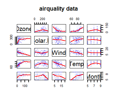
The pairs graph is simply build with a predefined function called pairs. This one build a dispersion graph table showing how each variable correlates with all the others. That is an easy way to graphically evaluate if some correlation exists between 2 dimensions.
> pairs(d,
        panel = panel.smooth,
        pch=".", lwd = 2,
        col = "blue",
        main = "airquality data")
The source code
The UI
Since we want a specific zone with input widget, we will use the simple sidebarLayout layout which proposes a left column with the inputs and a main central zone with all the contents, including outputs. Please note that input and output names are important for the manipulation since used as key.
 1sidebarLayout(
 2      sidebarPanel(
 3         sliderInput("month",
 4                     "Month:",
 5                     min = 5,
 6                     max = 9,
 7                     value = c(5,9))
 8      ),
 9
10      # Show a plot of the generated distribution
11      mainPanel(
12         plotOutput("pairs"),
13         tableOutput("values")
14      )
15   )
- line 3: this is the input for the months selector, since we know exactly the data set, we could simplify the code by inserting the correct boundaries. This slider is named
month - line 11: the main panel is stacking both output, the graph and the table. The other possible shiny outputs are mainly the raw text, the html text and a download button or link to get the data from the back end. The output widgets are named
pairsfor the graph andvaluesfor the table.
Server part
The server is holding the compute part of our program, uses the input values, compute the data and present the result in the output zones. When the user modify an input, only the server part that uses this variable will be evaluated, this is pretty efficient.
A specific function is used to populate each output zones, in our example a graph and a table.
The graph part will be installed in the pairs zone, first we filter the data to only present the selected month range from the slider:
   output$pairs <- renderPlot({
     d <- airquality[,1:5]
     d <- d[d$Month >= input$month[1] & d$Month <= input$month[2], ]
     pairs(d, panel = panel.smooth,
           pch=".", lwd = 2, col = "blue",
           main = "airquality data")
   })
The result of the last command in the code block is used to fill the output zone, here, the result of the pairs() function.
For the table part, the only modification is selecting the 10 first rows of the data set:
   output$values <- renderTable({
     d <- airquality
     d <- d[d$Month >= input$month[1] & d$Month <= input$month[2], ]

     head(d[order(d$Month, d$Day),], n=10)
   })
Conclusion
Here is our first dataviz with R and shiny. A very simple web interface that you could easily share on your intranet or web site. You could also use this kind of application directly from the RStudio tool to perform data exploration with data scientist and your clients.
What you should keep in mind is that it is easy to combine the power of the R language in data manipulation and the simplicity of web presentation. It is very easy to present analysis work that way.
We will see in a future post how to host this application in a dedicated container infrastructure and how to use more powerful data representation from an external library.
Photo from rawpixel
the hosting is performed on the shinyapps site and depends on the credits available on my free account. It may take some time to pop up and is using minimal resources, so not very responsive. Once computed, everything is performed by your browser. ↩︎